In what ways does your media product use, develop or challenge forms and conventions of real media products?
This question requires you to demonstrate how your research and planning has influenced your work. You'll need to review your research and planning posts and identify which elements from the music videos and artists you've researched have been incorporated into your final pieces.
·
During our research and planning stages we looked at a lot of music videos and digipak already in the industry we also looked at work from students from previous years which were posted on our teacher’s blogs, marks where higher for those that followed the conventions of a real music video and digipak. This is what is needed because it will make the audience automatically want to buy your music video and digipak because you have followed the conventions and nothing can really go wrong with it. You would need to find the perfect model for your video and know how they needed to be dressed and also how they needed to be presented on the camera and also on the digipak if wanted.
Our product is of an indie genre and our star is a young male solo artist. We therefore attempted to emulate the conventions of similar videos to that of our genre, with other artists such as mike snow, jack penate and Jamie T.
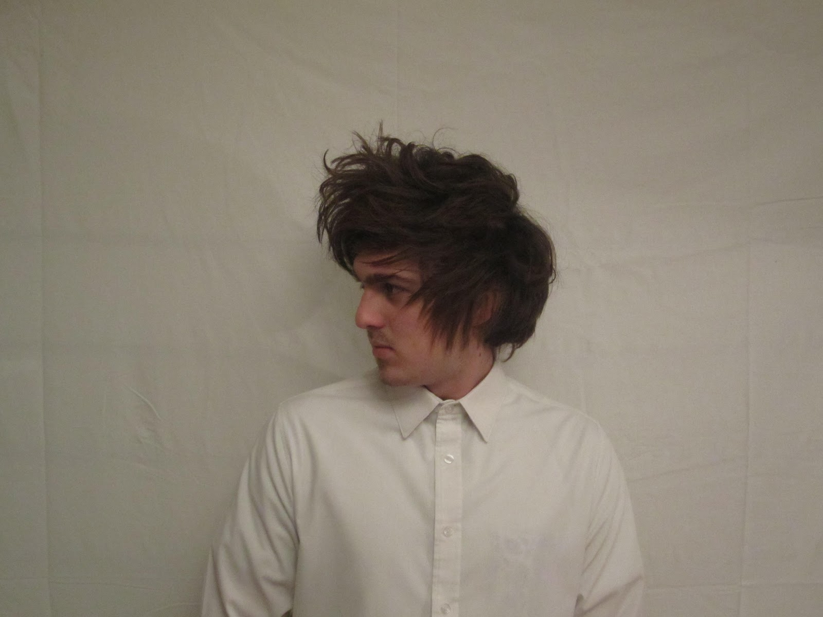
The conventions of a music video we have used for our product are;
•
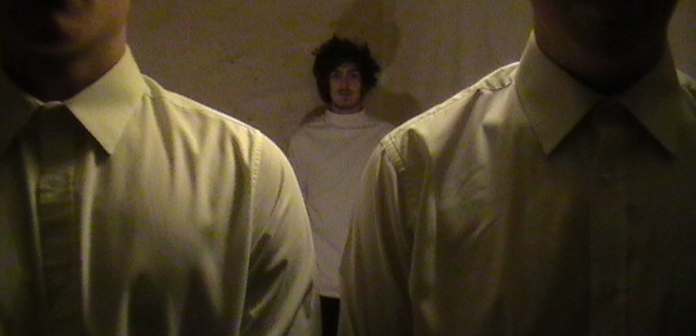
• Focus on star image, with 90% of shots being of our artist and the frequent use of close-ups highlighting him. This can be scene in all the videos we analysing, especially in ones from artists such as mike snow.
• Lip syncing throughout, important to link audio with video and express emotion through the artist’s expression.
• Most music videos cut to the pace of the song, our song is quite slow but fast in places so we decided to cut with fast pace and lots of them.
• We used a variety of shot distances and positions of our star.
• Our artists wore a few different outfits to show the change of time and increase variety and interest. In the videos we evaluated this was also a common idea of having lots of outfit changes, this increases the interest.
• We cut between different scenes and settings to add variety and interest.
For my poster and Digipak I based the layout of already made digipak and posters this is because a conventional digipak and poster would appeal more to everybody because its what the audience likes to see and from this I thought I could get more people buying it.
• I used did not use an image on my digipak or poster, I use a font type with colour inside by using different effects etc. I think this really worked.
•
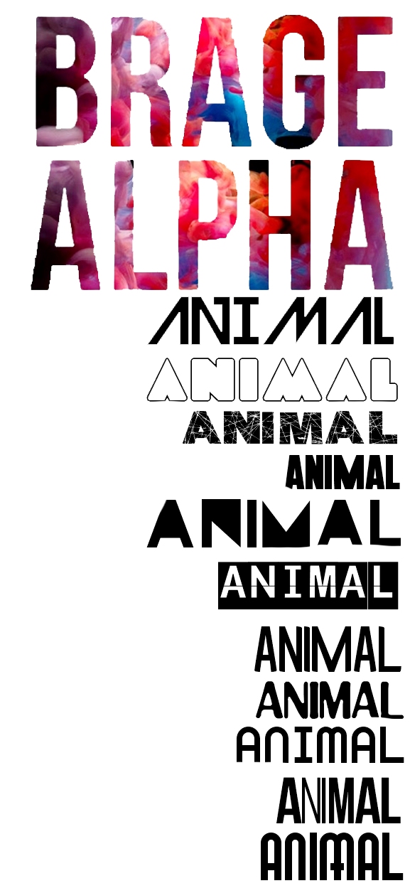
I used only a few fonts on the poster and Digipak so it wasn't too busy and there was consistency. On other digipak and posters I looked at the artists name was more of a logo rather than a type face/font I felt this looked really effective and I attempted to achieve this myself with the chosen font of my artists name, as it is distinct and recognisable from other artists.
• The cover image I decided upon was my self generated ‘logo’ I chose this font as it allows the target audience to establish what our artist is about and it doesn’t really give too much away about the artist and this would make the target audience want to get to know him by looking inside/looking at music video. When researching I also found that other digipak of the same genre frequently used images that where not always of themselves to portray a different look.
• For the back cover of my digipak I made sure I included the vital conventions I had identified on other products. This included the presents of a barcode, track list and copyright small print.
• Details on my poster that I had noticed across similar products were the details of the release date of the album, and ratings from other music magazines or video sites, I did this and made up my own record company to make a little logo for the small print, I also made a ell known date for the release date which was 10/11/2012 which is on a Saturday which from my research is when most music videos and CD’s are released on.
· In other genres such as indie, album's can often be rather minimal and simple with panels of a single block colour. So this is what I created. I therefore followed this convention with the use of grey and a simple mixture of colour for most of my font.